Cashnest
01 About:
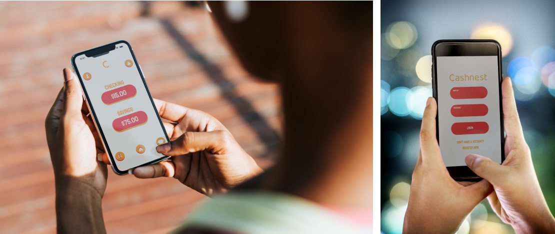
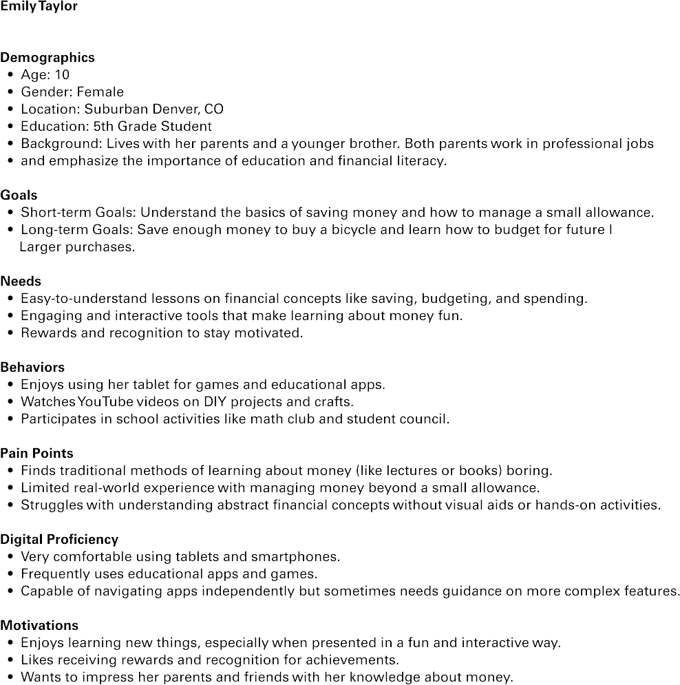
CashNest is a financial education app designed to teach kids aged 8-15 about responsible money management, saving, and budgeting in a fun and interactive way. This case study delves into the design and user interface aspects of the app, highlighting its icon designs and key interface pages.

02 Persona:

03 Designs:
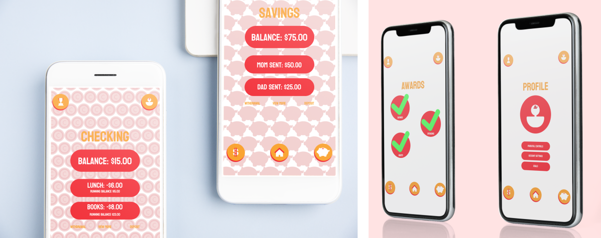
CashNest is designed with a vibrant and user-friendly interface to engage kids aged 8-15 in learning about financial responsibility. The app uses bright colors and playful graphics to create a welcoming and enjoyable learning environment. The layout is intuitive, with large, easily clickable icons and clear navigation that allows users to quickly access different sections of the app, such as budgeting tools, savings goals, and educational games. The app’s interface is designed to be straightforward, minimizing complex terminology while maintaining enough depth to foster an understanding of financial concepts.

04 Icon Design:
The icons use a consistent color palette that matches the app's overall branding, typically featuring shades of red, white, and gold to symbolize money, security, and growth. This unified approach helps users intuitively understand the purpose of each button, facilitating a smoother user experience. The simplicity of the icons ensures they are not only appealing to the young target audience but also straightforward to use, contributing to the app's fun and interactive learning environment
