Tri-C Branding
01 About:
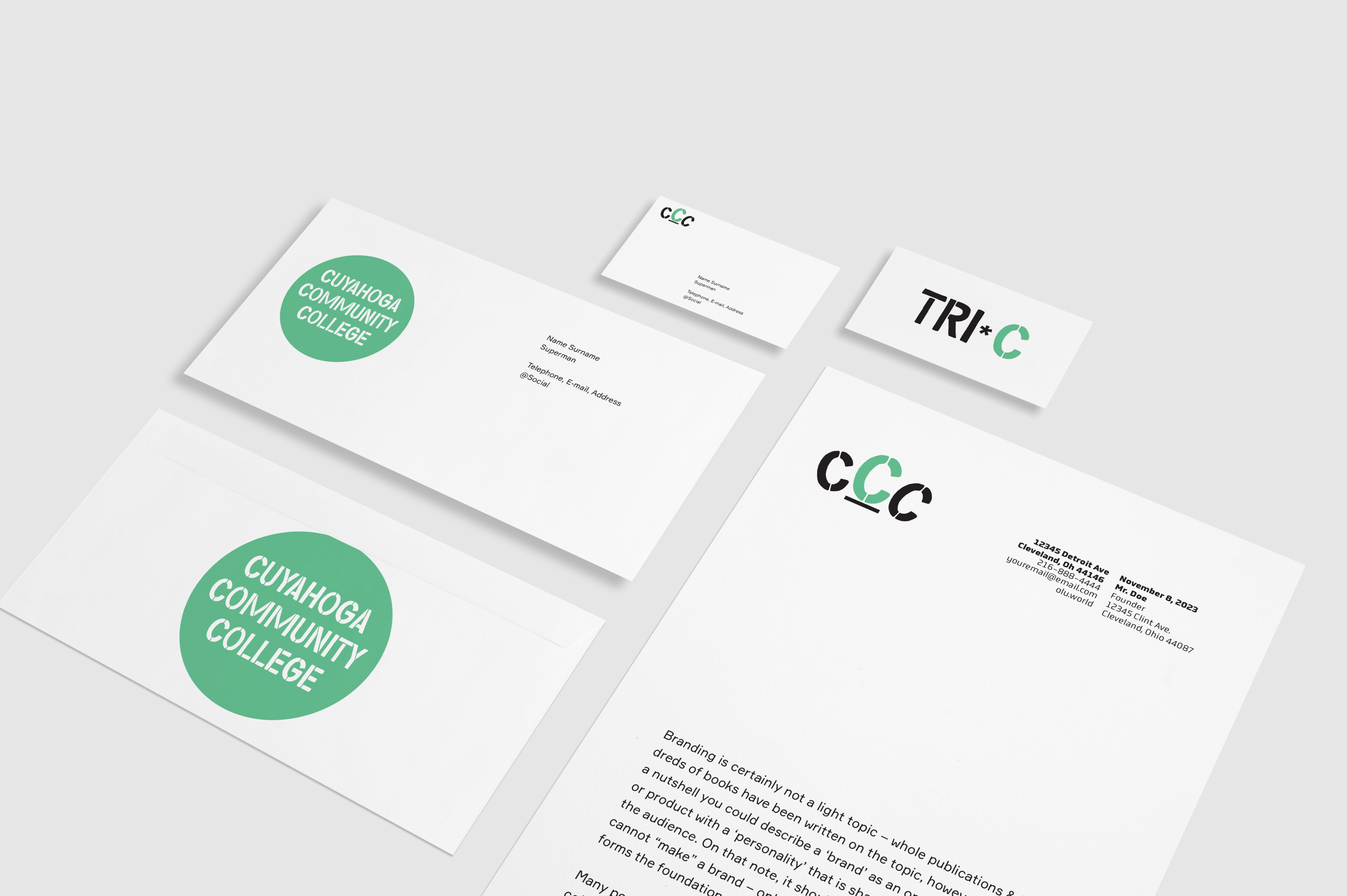
Cuyahoga Community College (Tri-C) is an institution dedicated to excellence and accessibility in education. Its brand essence revolves around the commitment to provide outstanding educational opportunities while ensuring accessibility to a diverse community. Tri-C aims to revitalize its brand identity to reflect these core values. Success in this endeavor will be measured through enhanced brand recognition, resonating with a broad and varied audience, as well as increased enrollment and greater community engagement. Ulti- mately, Tri-C seeks to become a beacon of excellence in education and a catalyst for positive community impact.
02 Rationale:
The addition of a paperclip to the T-Mobile logo is a clever and minimalist design choice that effectively conveys the concept of connectivity. It symbolizes the simplicity and ease with which T-Mobile enables connections, as effortlessly as fastening two pieces of paper. This design captures the brand’s essence, emphasizing user-friendly and accessible connectivity services. The paperclip also reflects the brand’s commitment to innovation and staying at the forefront of telecommunications, where even the most basic tools can be elevated to symbolize connectivity. In summary, this design element serves as a strong visual representation of T-Mobile’s core mission making connections easy and accessible for everyone.
03 Rationale:
The addition of a paperclip to the T-Mobile logo is a clever and minimalist design choice that effectively conveys the concept of connectivity. It symbolizes the simplicity and ease with which T-Mobile enables connections, as effortlessly as fastening two pieces of paper. This design captures the brand’s essence, emphasizing user-friendly and accessible connectivity services. The paperclip also reflects the brand’s commitment to innovation and staying at the forefront of telecommunications, where even the most basic tools can be elevated to symbolize connectivity. In summary, this design element serves as a strong visual representation of T-Mobile’s core mission making connections easy and accessible for everyone.

04 Rationale:
The addition of a paperclip to the T-Mobile logo is a clever and minimalist design choice that effectively conveys the concept of connectivity. It symbolizes the simplicity and ease with which T-Mobile enables connections, as effortlessly as fastening two pieces of paper. This design captures the brand’s essence, emphasizing user-friendly and accessible connectivity services. The paperclip also reflects the brand’s commitment to innovation and staying at the forefront of telecommunications, where even the most basic tools can be elevated to symbolize connectivity. In summary, this design element serves as a strong visual representation of T-Mobile’s core mission making connections easy and accessible for everyone.