T-Mobile Branding
01 About:
T-Mobile is a telecommunications company that distinguishes itself through its strong customer-centric approach and a relentless commitment to innovation, setting it apart in the highly competitive telecommunications market.
02 Rationale:
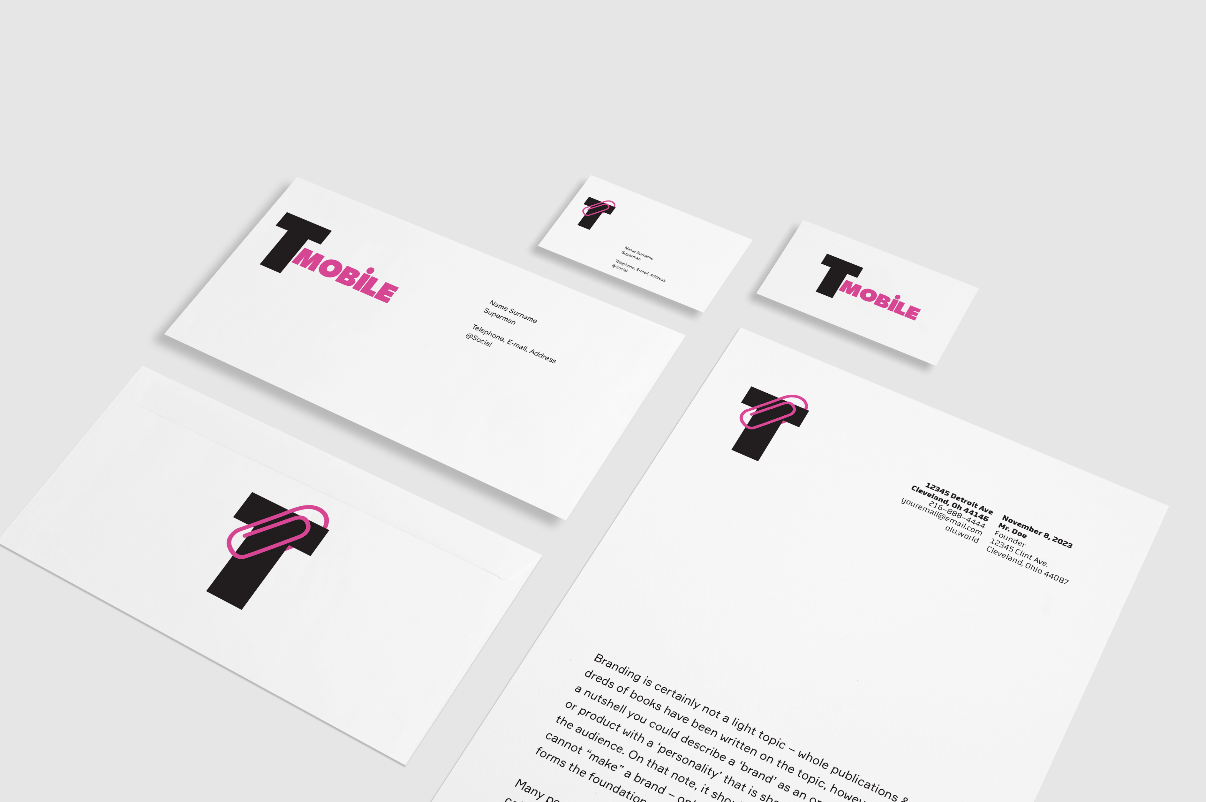
The addition of a paperclip to the T-Mobile logo is a clever and minimalist design choice that effectively conveys the concept of connectivity. It symbolizes the simplicity and ease with which T-Mobile enables connections, as effortlessly as fastening two pieces of paper. This design captures the brand’s essence, emphasizing user-friendly and accessible connectivity services. The paperclip also reflects the brand’s commitment to innovation and staying at the forefront of telecommunications, where even the most basic tools can be elevated to symbolize connectivity. In summary, this design element serves as a strong visual representation of T-Mobile’s core mission making connections easy and accessible for everyone.

03 Rationale:
The addition of a paperclip to the T-Mobile logo is a clever and minimalist design choice that effectively conveys the concept of connectivity. It symbolizes the simplicity and ease with which T-Mobile enables connections, as effortlessly as fastening two pieces of paper. This design captures the brand’s essence, emphasizing user-friendly and accessible connectivity services. The paperclip also reflects the brand’s commitment to innovation and staying at the forefront of telecommunications, where even the most basic tools can be elevated to symbolize connectivity. In summary, this design element serves as a strong visual representation of T-Mobile’s core mission making connections easy and accessible for everyone.